A logo design should not be taken lightly! It takes time and attention to your feelings about your business. I follow your lead and develop ideas that truly reflect what you want your business to be.
What follows are final logo designs, and some of the earlier concepts that led us to the design solution.
Posttime Wealth Solutions
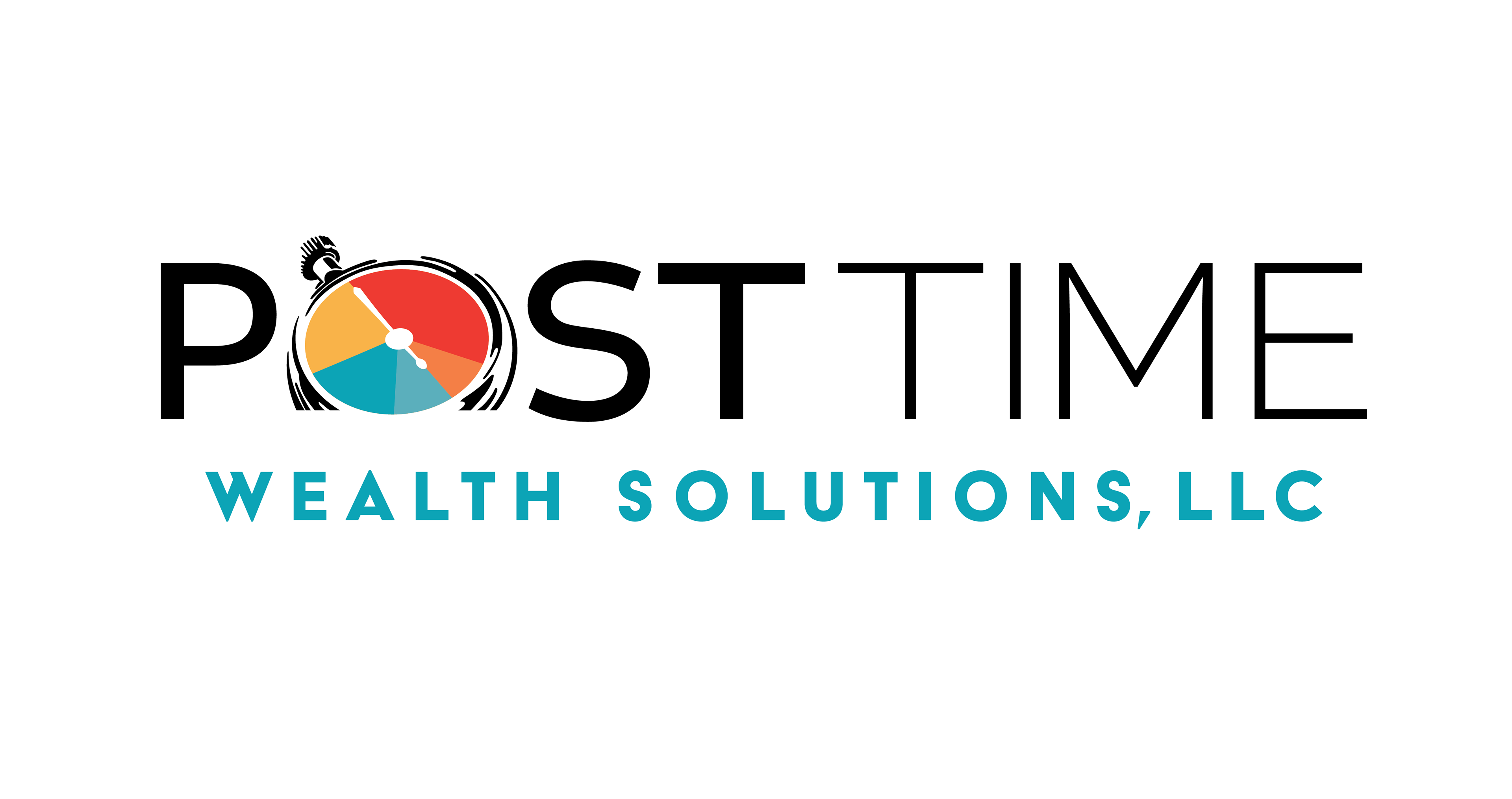
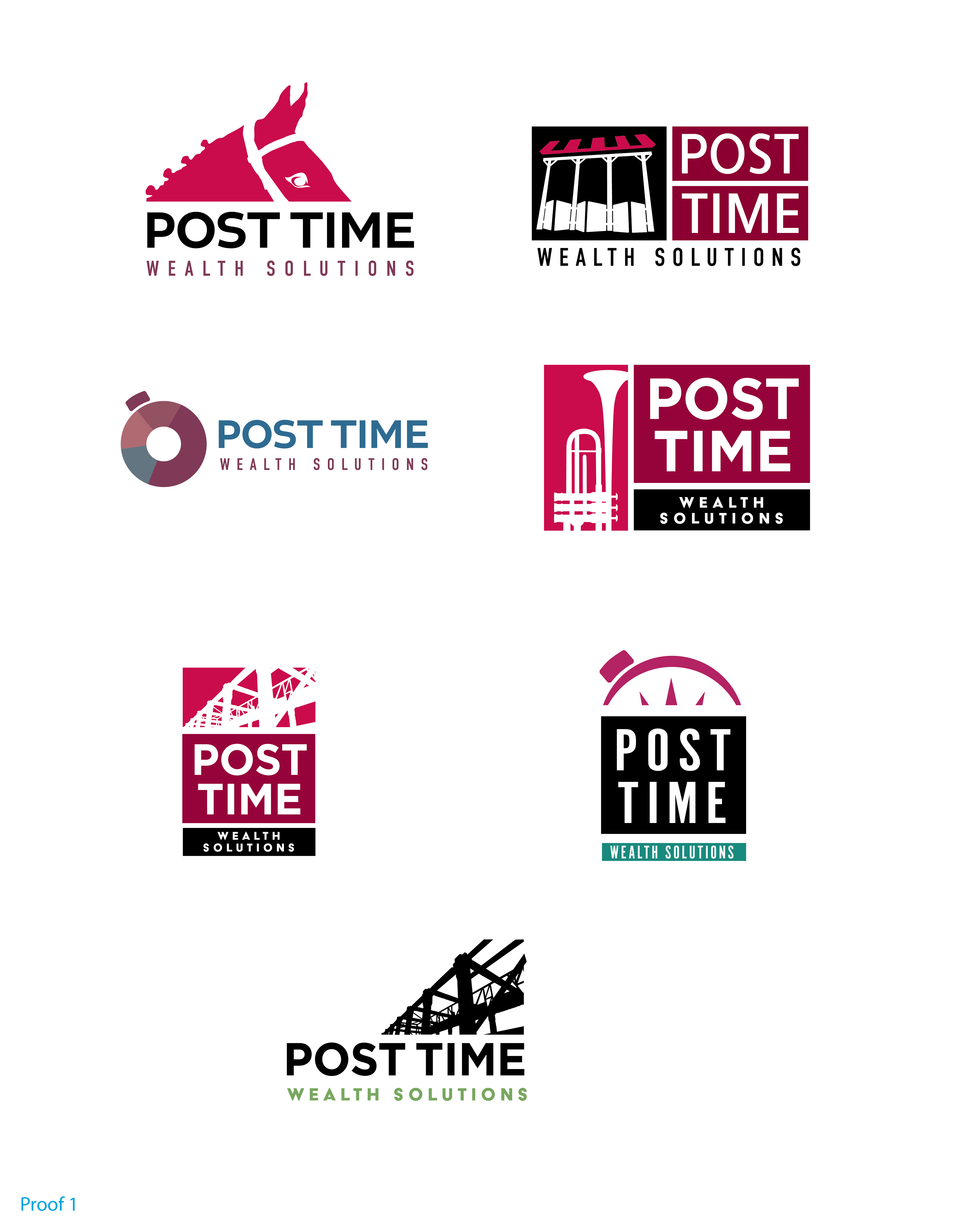
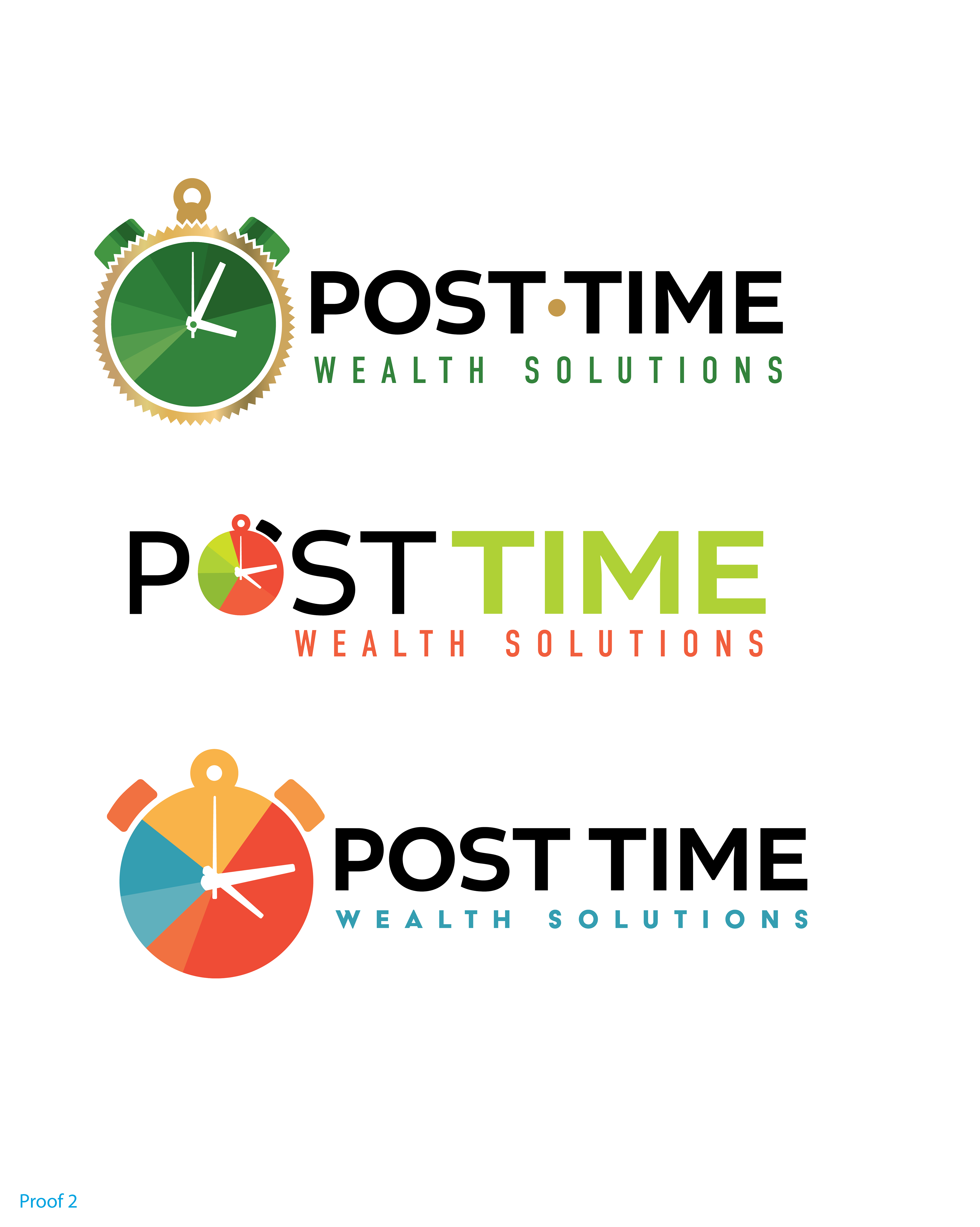
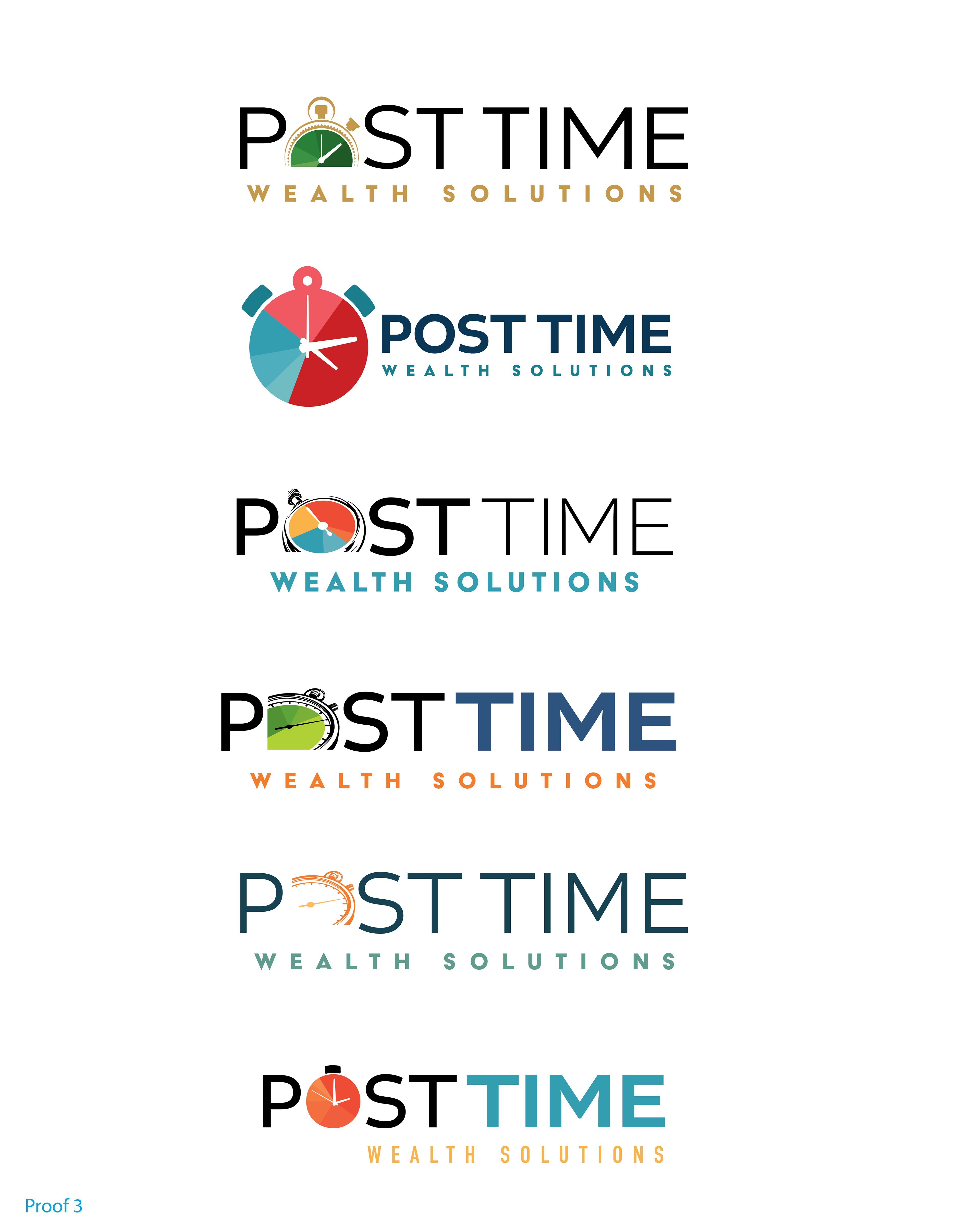
Above is an abbreviated look at the development of the Posttime logo. The client is located in Saratoga, NY, home to the famous racetrack. Posttime is a reference to the races. They requested a logo that would remind viewers of the racetrack, hence the first proof with a horse, starting gates, bugle and timers. The client was most interested in the timer, so in the 2nd proof I developed options (there were many more!) that included a clock. On the 3rd proof, we concentrated on the clock specifically replacing the "O" in the word Post. I recommended color scheme options, and we concluded with the serious & classic, yet up-to-date logo choice.
Shalom Alliance
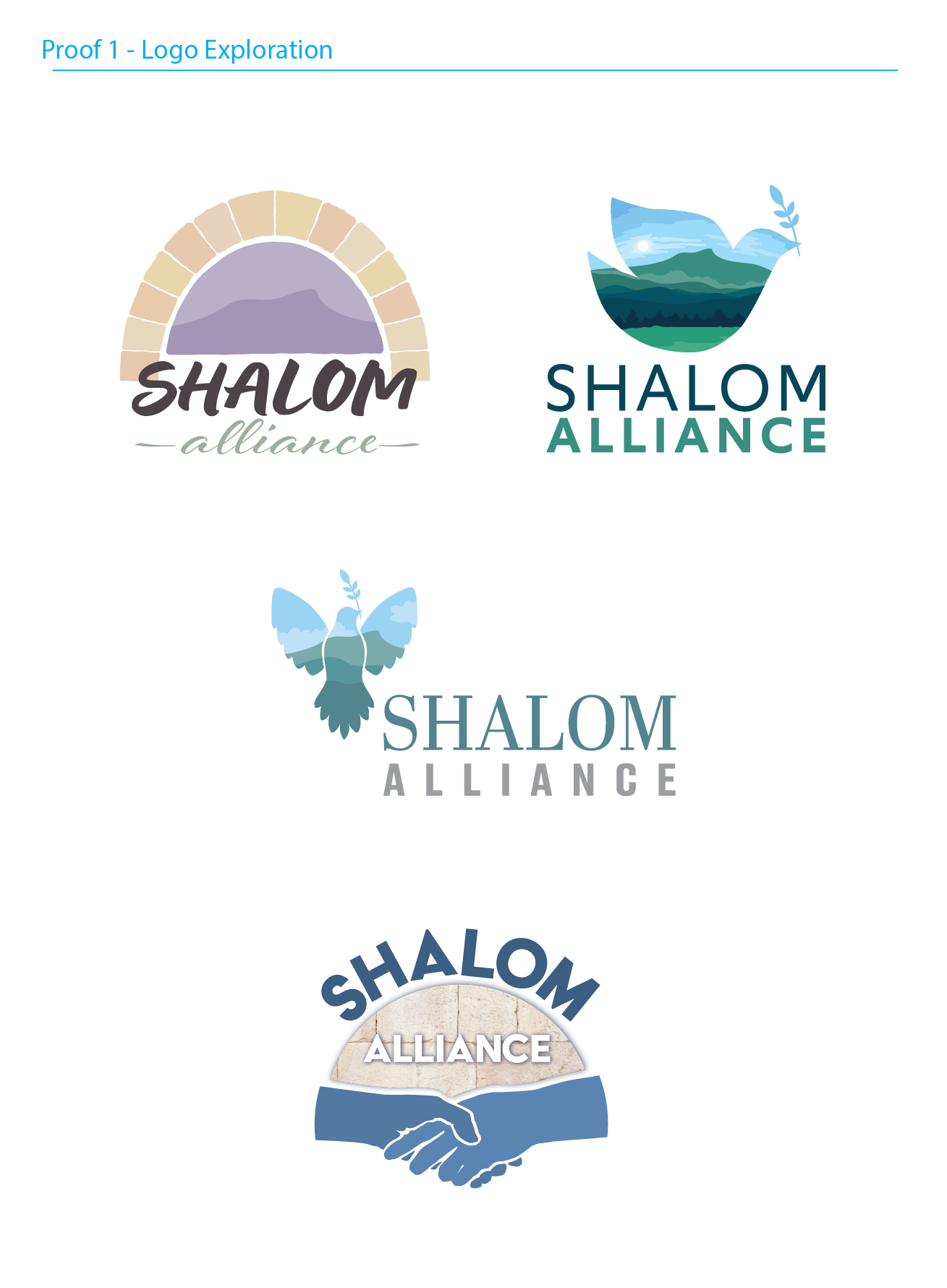
Proof 1
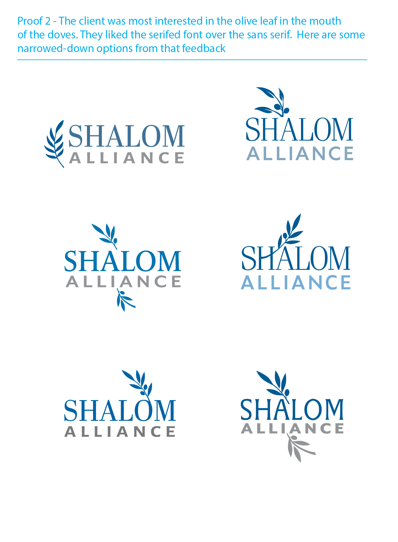
Proof 2

Color Exploration
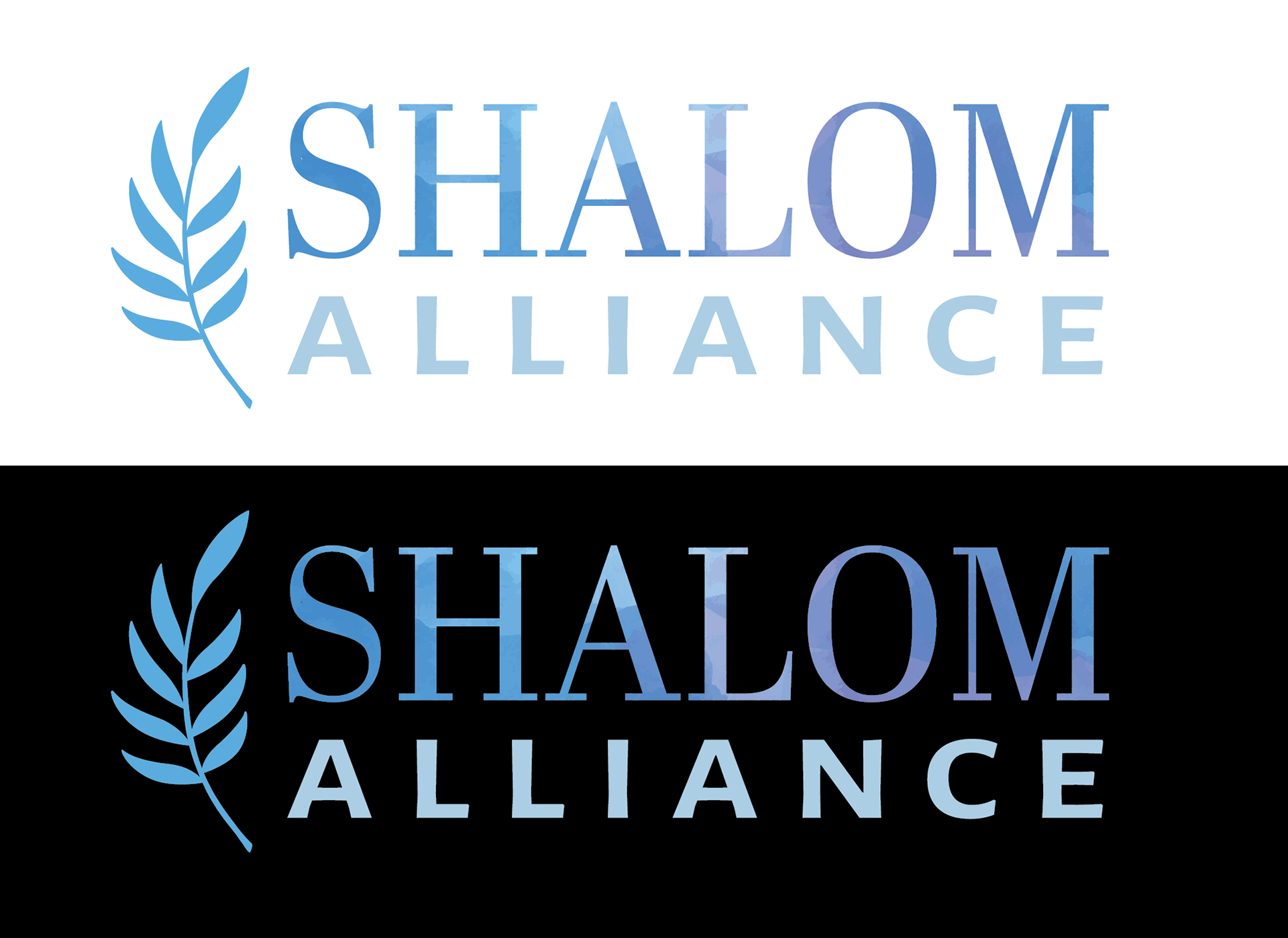
The logo for this Jewish advocacy organization is designed to look equally good on a dark background as it does on a light one. Take a look below to see the progression from first proof to final design.
AADI
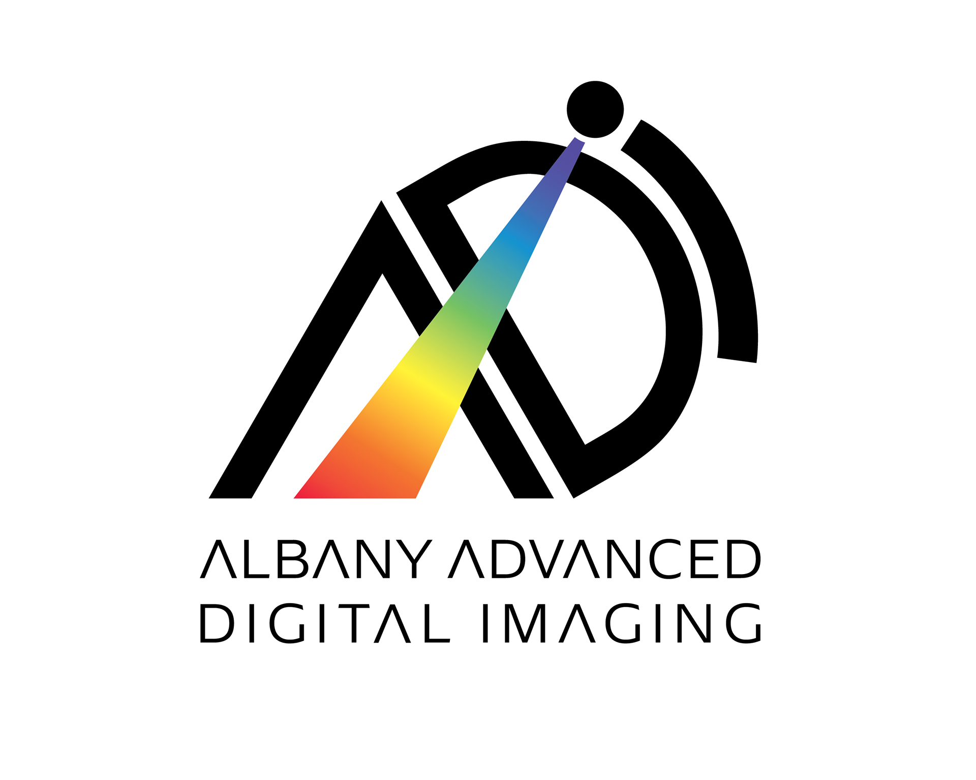
Final choice
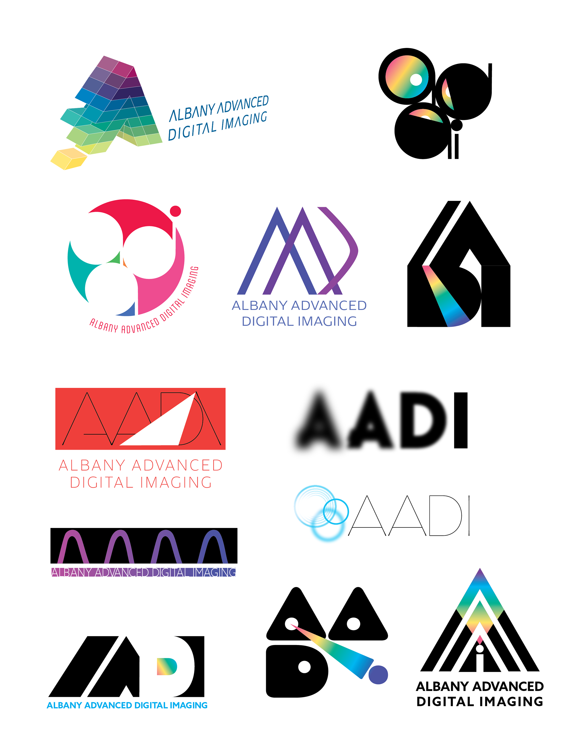
A selection of exploration of concepts
The client wanted a unique logo that emphasized the novel use of light in their digital imaging systems. The subject matter was so interesting, it was really fun to come up with early concepts.
BioCrystal, Inc.
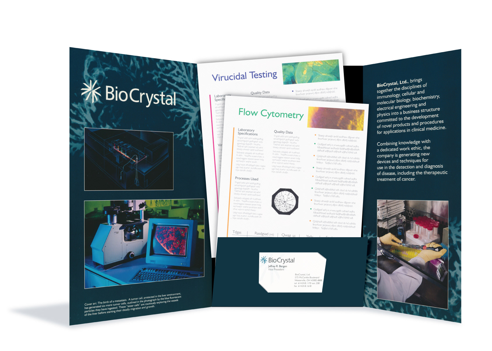
BioCrystal is a biotech firm, developing a crystal-based method of locating metastatic cancer cells. The art on the folder's cover are microscopic images taken by the firm's scientists. I oversaw photo shoots of the biology labs and helped develop product names and identities as well.
Damask
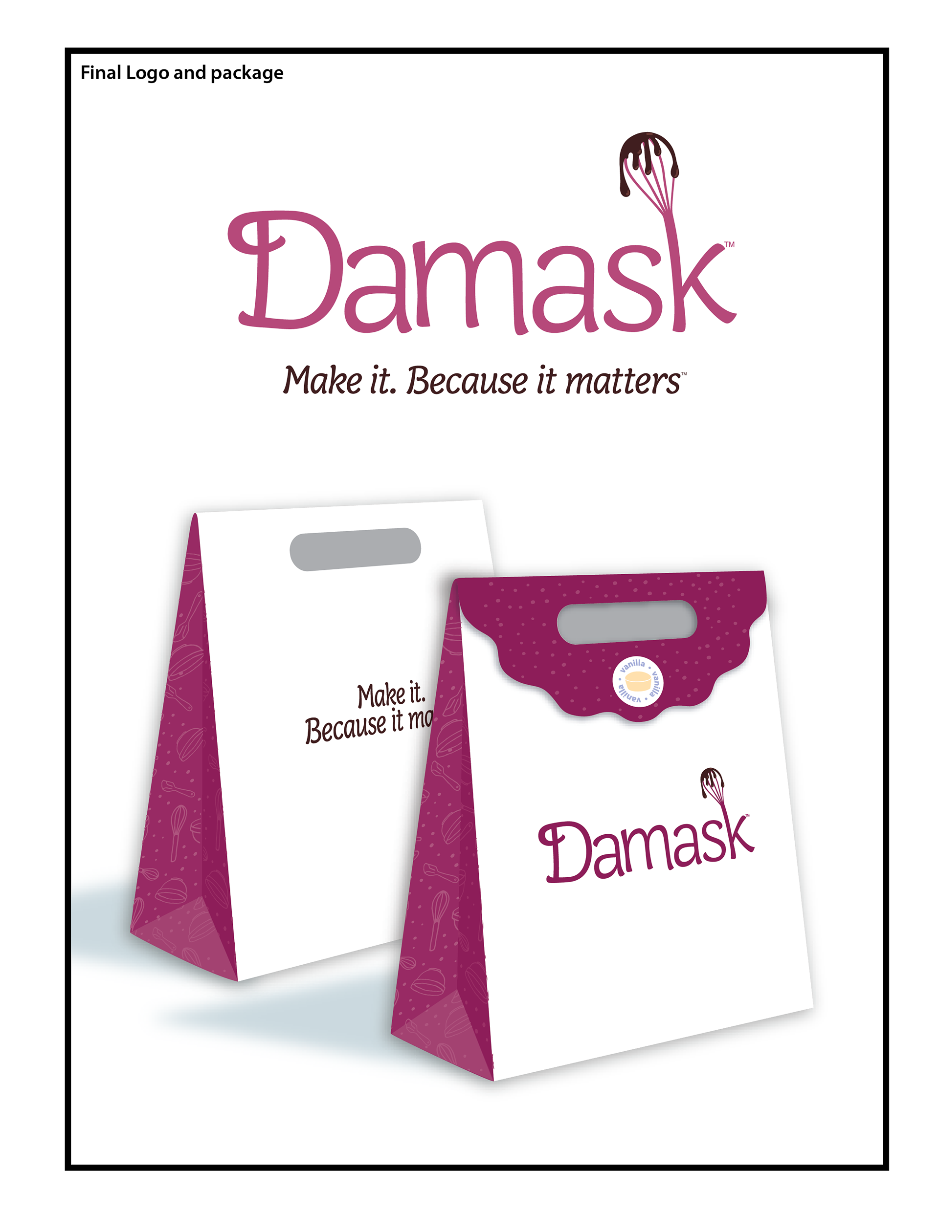
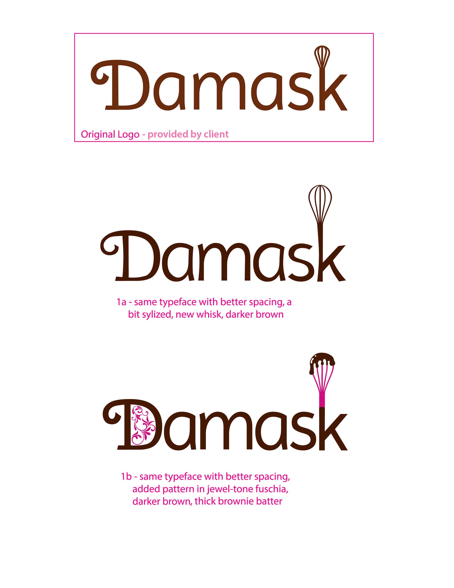
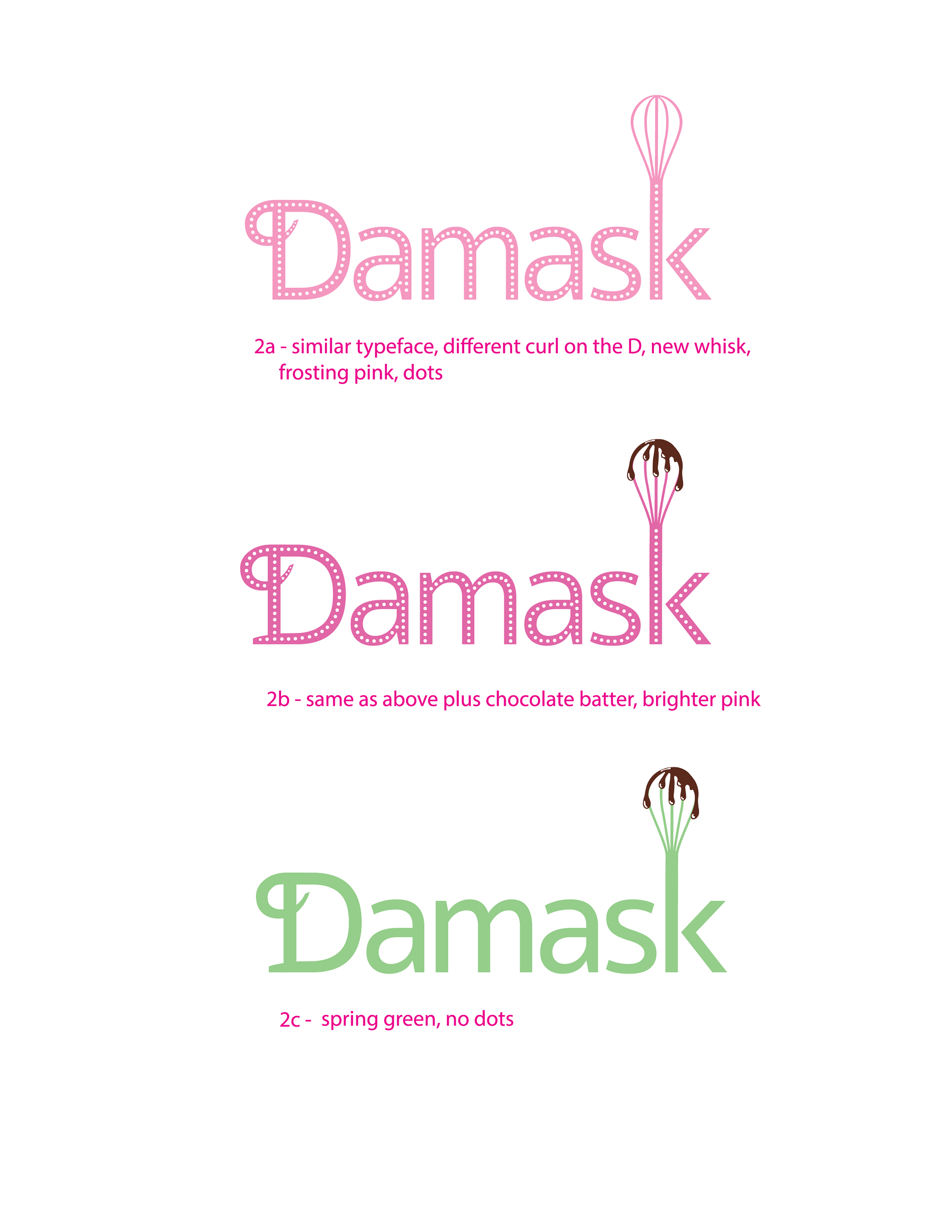

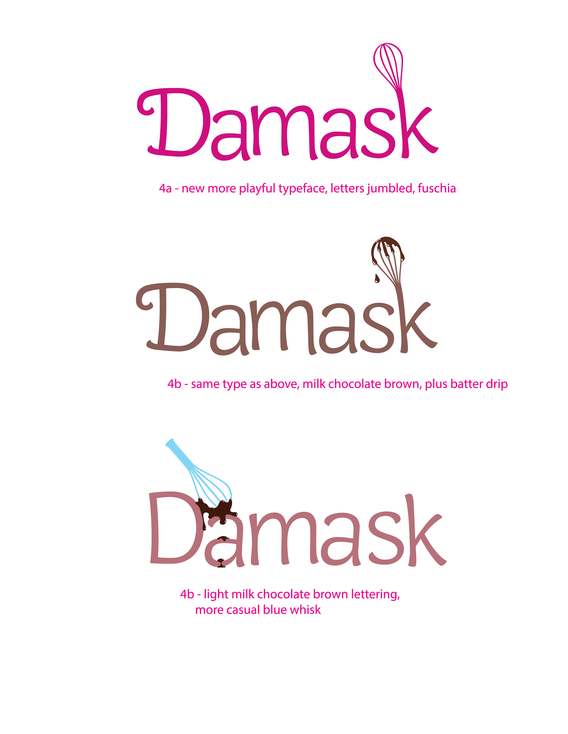
This client was starting up a high-end online cake-kit business. They wanted to emphasize that "baking is fun" and that it's ok to make mistakes in the kitchen. I developed concepts for them that featured their pre-existing whisk, but gave it some whimsy. The dripping batter matched their message best of all.
LaPlante Home Services
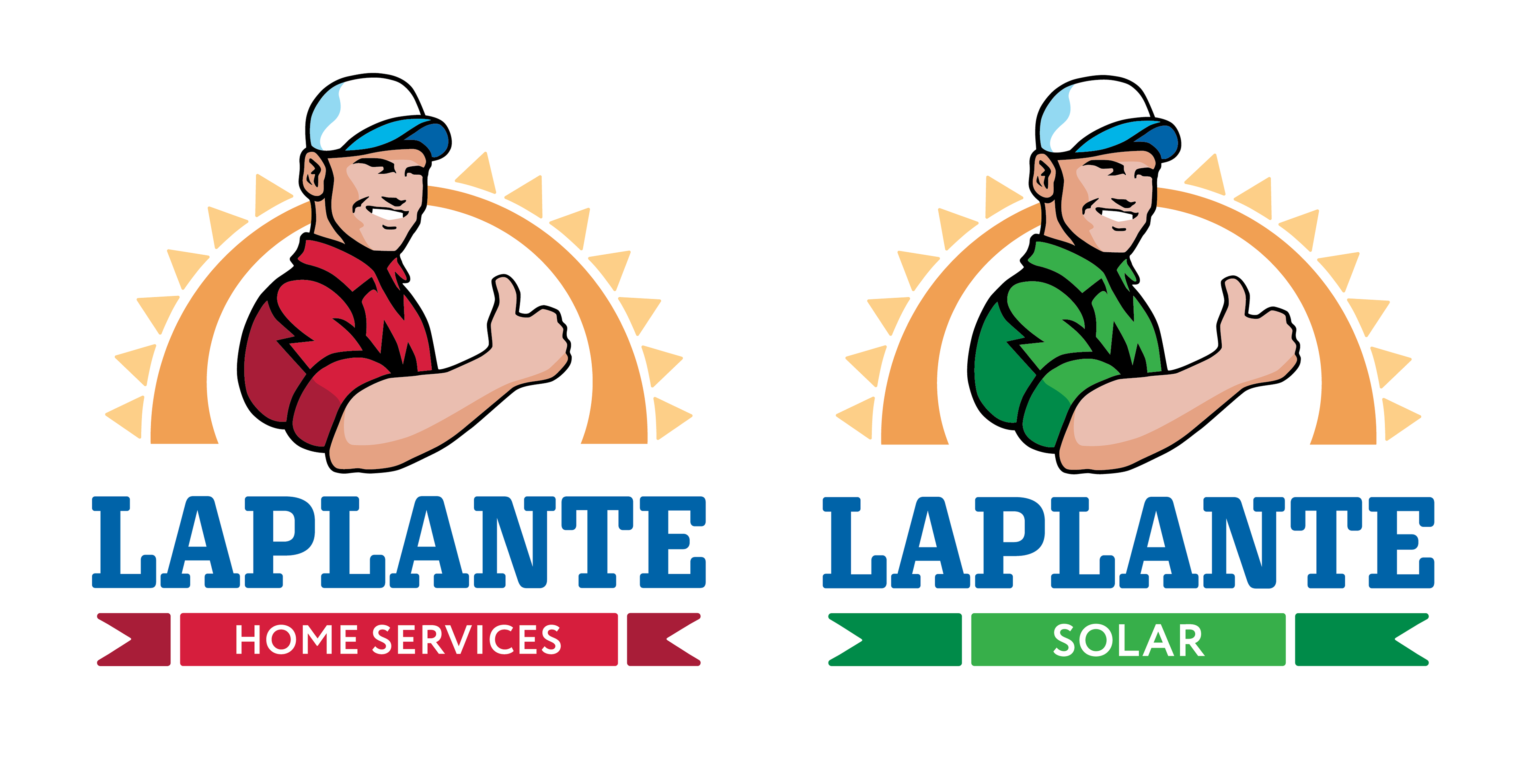
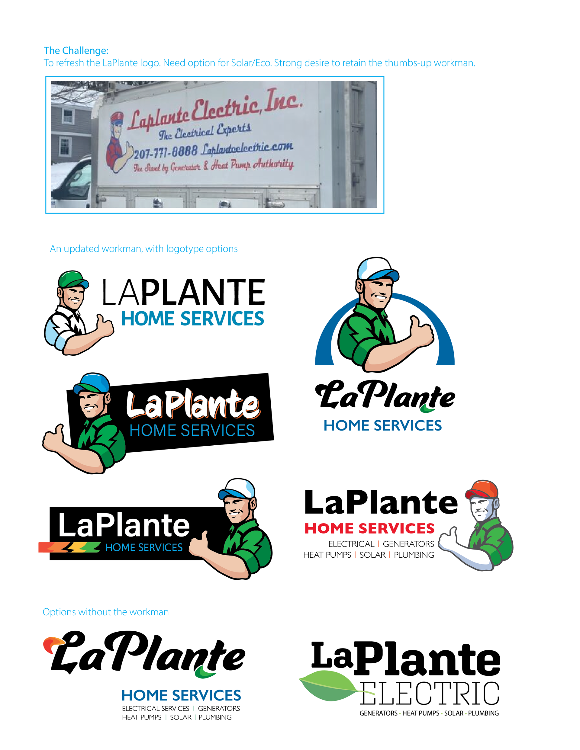
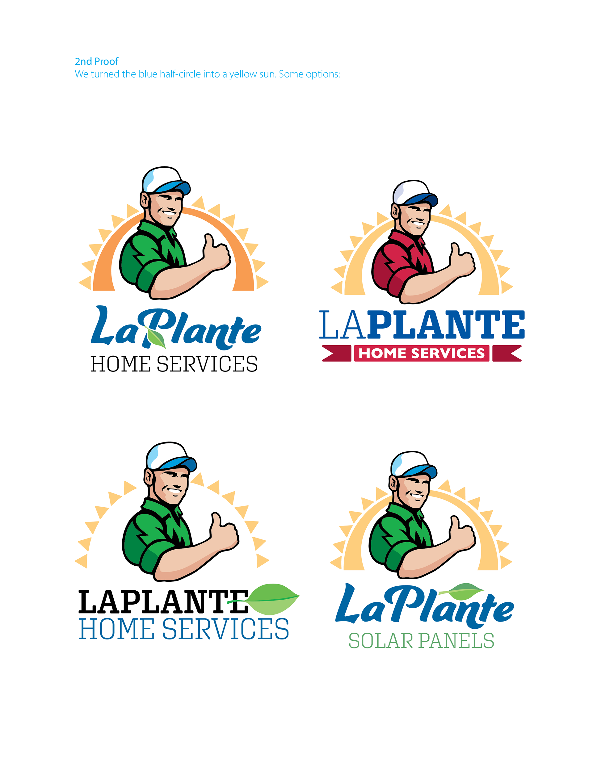
LaPlante Home Services is an expanding, family-owned business. As they grew from "Electrical Experts" to a full range of Home Services, they wanted an updated logo that still reflects upon their long tradition of trustworthy service to their Maine community. They wanted an update for the 2020s, but they needed a nod to tradition. The rule was that we had to keep "The Guy". I brought him into this era, maintaining the patriotic colors and freshening up the entire look. After we were done, I made a version for the Solar side of their business.
Albany Wellness Project

Final choice

A sampling from the logo exploration
Albany Wellness Project is a new company guiding clientele through healthy, holistic recovery from illness and injury. Website and brochures are being developed.